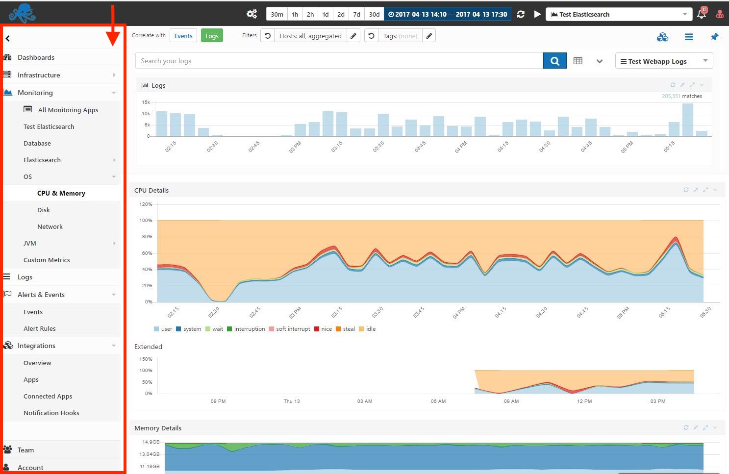
We’ve restructured the UI …. bigly :).
Everything you need can be quickly accessed via tabs on the left. Account section is exposed, and Team-related functionality (invitations to apps or to account, user roles, etc.) is in its own Teams section.
Dashboards are in top-left. Metrics, Logs, and Events are right there next to each other. AppMap, NetMap, and a top-like view of all your Servers is under Infrastructure. Jumping to a specific Metrics or Logs App or a Dashboard can be done quickly from the searchable pulldown in top-right. If you have access to multiple accounts you can switch between them much like you can switch between multiple Google accounts.
Log in to see for yourself and check it out….. or read below about a few more improvements we’ve made.
In the process of reworking the UI we’ve built and open-sourced sematable – a beautifully simple table component for React.js and Redux apps. We use it for showing things like a list of all your Metrics and Logging apps, exposing more useful information about each app, like their plan, status, your access role, etc.
We’ve made a ton of other improvements big and small, far too many to list here. We’ve put – and continue to put – a lot of thought in the UI/UX and the reactions so far have been great!
Here are a couple comment from our users:
It is very clear, very easy to use, nice, reactive. I am impressed and you should definitely be more vocal about it. 🙂
one user said.
Yes, the new workflow is perfect, and very intuitive (and better time window selection lately).
another user mentioned.
See anything in the UI that is suboptimal? Have any other suggestions or wishes?
Leave a comment, send us email, tweet @sematext, or use our live chat!
