Heatbar
Heatbar is a single-line heatmap that is shown above the main, time-series chart.
You can style any series as a heatbar, but it's especially suitable for events and logs.
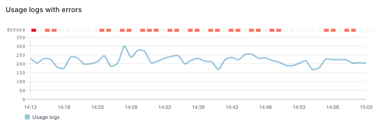
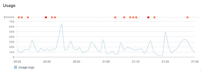
Here you can see a time-series chart which shows the total number of logs and, above it, a heatbar which tracks only errors among them.
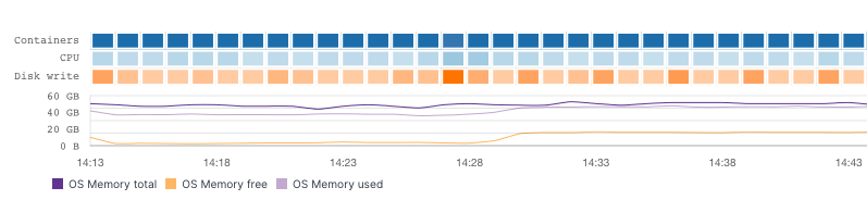
A chart can have multiple series configured as heatbars, like in the following example:
If all of the series are heatbars the main time-series chart is not even shown.
For example, the following chart is configured to show a single heatbar series, CPU User grouped by OS Host:
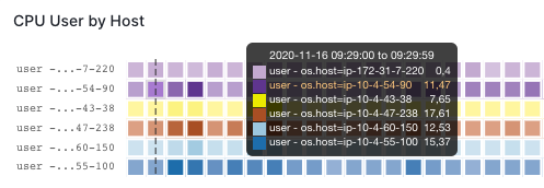
The chart shows six heatbars because the CPU User metric was reported by six different OS Hosts during the observed time range.
Creating Heatbars
Let's build the Usage logs with errors component together.
Since the total number of logs is not particularly interesting, we'll monitor a certain subset of logs, for example logs which contain the word Usage.
We'll have our time-series chart tracking all Usage logs and additionally, we'll use a heatbar to track only errors, like we've seen in the first Heatbar example above.
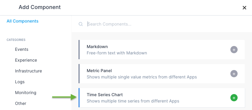
In your dashboard, click on the Add component button on the top of the screen, which looks like this:
In the first dialog choose Time Series Chart:
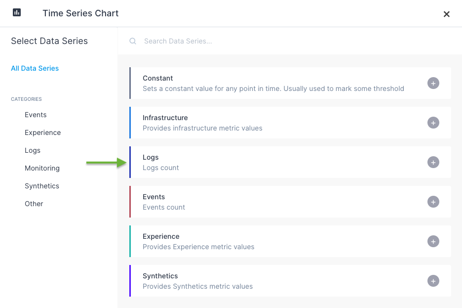
Then choose Logs data series:
If you're creating your first chart, the initial result may look intimidating at first glance:
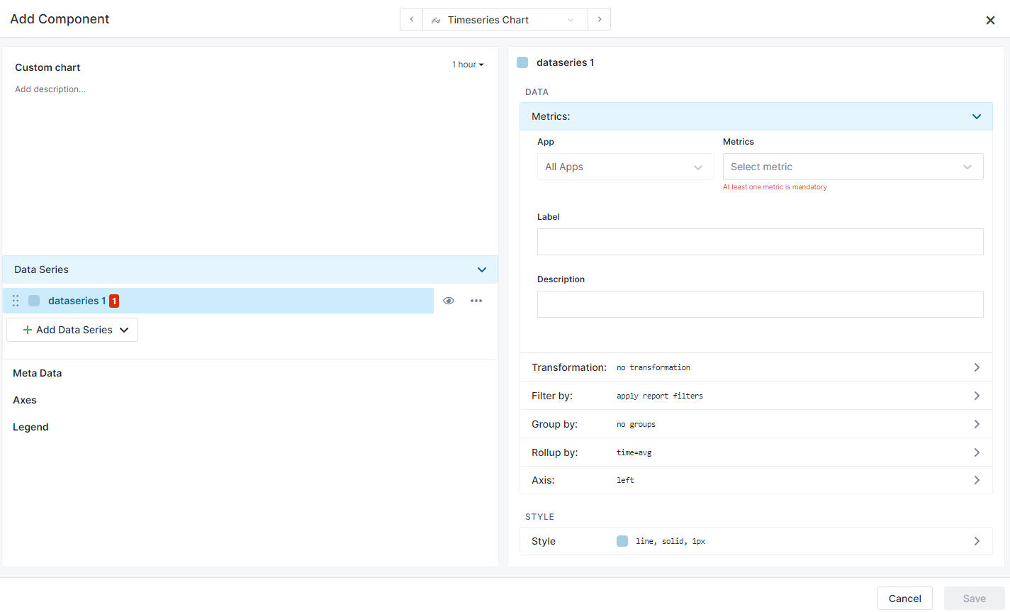
It's just a matter of choosing what we want our chart to show. So far we've chosen a type of chart, but haven't specified which App to use as the source of data and which metric from that App to show.
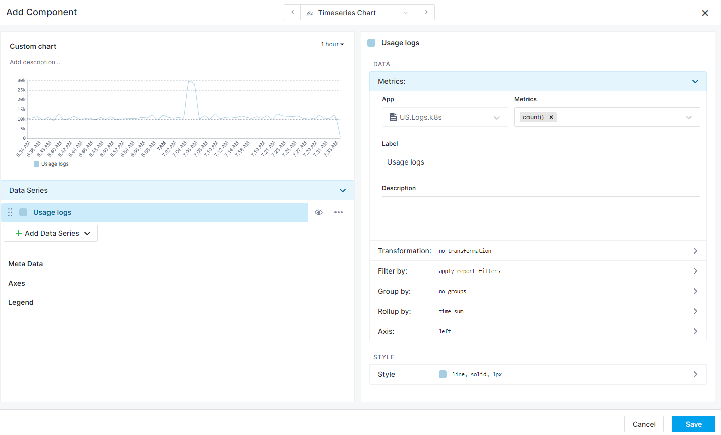
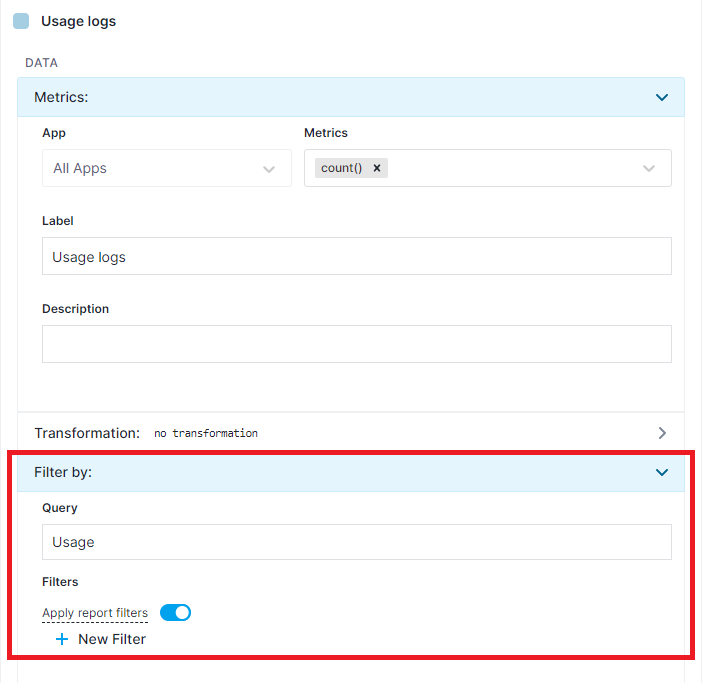
In the App field, choose any Logs App that contains data and in the Metric field choose a special function count(), which represents the number of logs.
We'll name this data series Usage logs, so type that into the Label field.
Great, errors are gone and we already see data in our chart preview:
Let's keep things organized, change the Custom chart title in the upper left corner to Usage. You just need to click on the title to edit it in-place.
Next, in the Filter by section, shown below, we are going to add a filter to our data series by typing Usage into the Query field. When you're done typing, you can apply the change with the Enter key (while the cursor is still in the Query field) and the chart will be updated, now containing only those logs which matched the query.
So far so good, we can see our Usage logs in the chart preview.
Now let's add a heatbar.
Duplicate Usage logs series using the series action menu (...), like this:
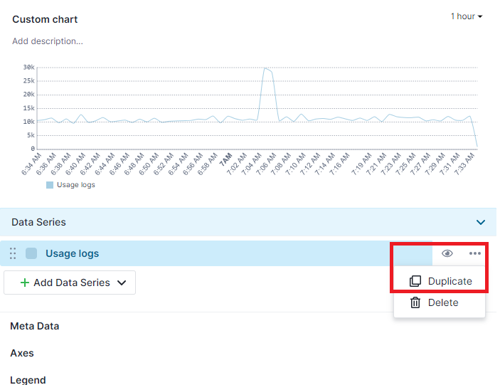
Change the label of the new series to Errors.
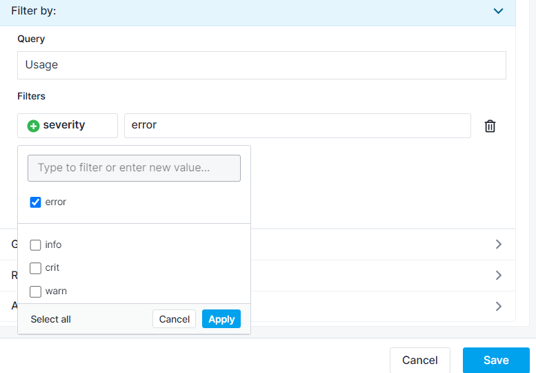
Expand the Filter by section, under the Label. As you can see in the screenshot below and hopefully in your own chart, our query: Usage is still here, duplicated correctly from the first series. We'll additionally filter logs to only those with severity: error:
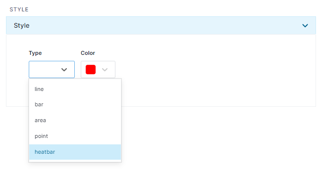
Finally, switch to the Style section of our second data series in the upper right corner and change its type to heatbar and color to red.
And just like that, we have our Usage chart with a heatbar of Usage errors.
Accessing data in Heatbars
Clicking on a heatbar square opens a panel with a list of Usage errors from the corresponding time range.