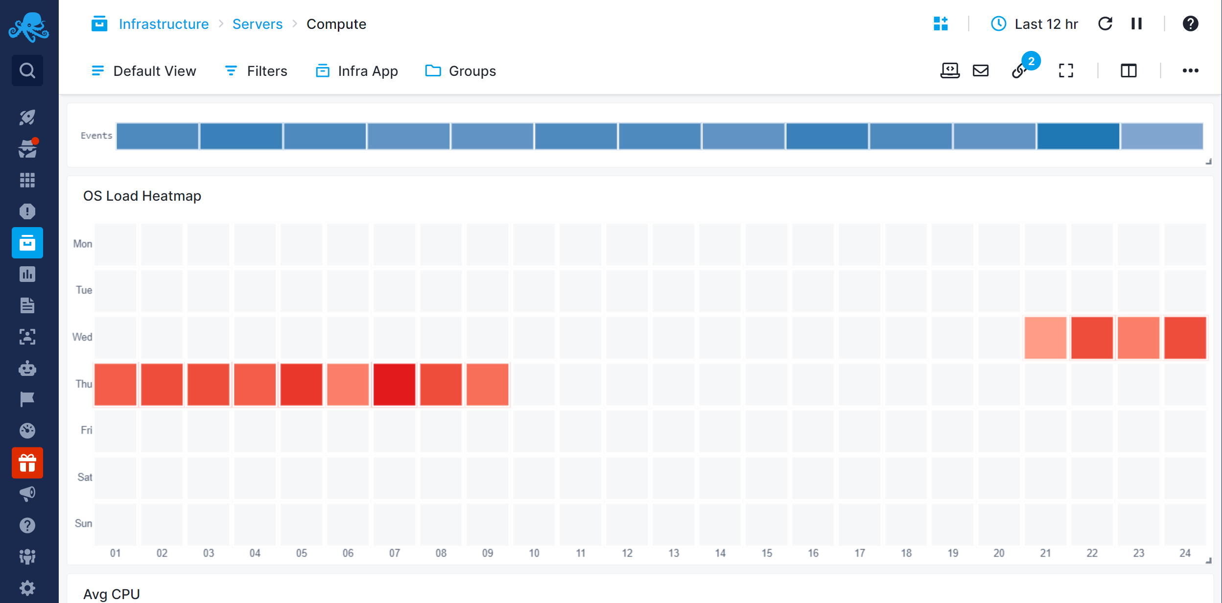
Heatmap
The Heatmap is a two-dimensional representation of data, where values are represented using color saturation. The vertical axis shows weekdays, while the horizontal axis represents the hours in a day.
With Heatmap you can visually represent historical data to gain actionable insight into how to improve performance.
Configuration
You can configure the chart either during its initial creation or afterward by clicking on the three dots that appear on hover and selecting 'Edit Component'.
- Choose All Apps or a specific App that you want to fetch data from.
- Choose one or more metrics metric
- Enter optional parameters such as:
- Transformation
- Filter By
- Group by
- Rollup By