Chart Builder
The Chart Builder lets you create visualizations of the data sent to Sematext. It lets you build charts for metrics and logs. Charts created through the builder are added to your dashboards and reports as dashboard components. Configuring a chart requires specifying a list of series with metrics, optional filters, and groupings. Charts built through the builder give you insight into spikes and trends, helping you to understand how your infrastructure or applications behave now or how they behaved in the past.
You can display many series on a single chart. Each of them can be configured to have its own color and style:
- bar
- line
- area
- points
Each series should be configured in a series configuration panel. The panel where you change the settings of each series is split into a couple of sections.
Data source
With Chart Builder you can create charts and other visual components for all App types available in Sematext. We support Monitoring, Logs, Experience and Synthetics. This gives you huge flexibility when building your own dashboards. It is possible to build a single chart which contains data series from Apps of different types, making it possible to visualize for example a correlation of CPU usage on a host with Error logs or user satisfaction. You can place such a chart on a dashboard.
Metric names
In the Metrics section you pick one or more metrics which are used to build a data series. If you pick more than one metric you have to apply transformations to let Chart Builder know what's the relationship between the metrics. If you don't write your own transformation expression then all metrics are added to each other producing a single series.
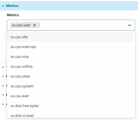
On the list of metrics you can find a special metric count(). This
metric is available for Logs and represents the number
of matching logs.
Only latest interval
Only Latest Interval toggle is available in bar, pie & donut, geomap, and numeric components. When it is toggled on, only the latest value of the selected metric is displayed within the specified time range.
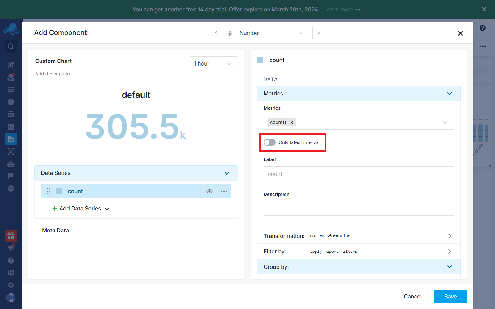
If the Group By option is selected when only latest interval toggle is on, the displayed value will depend on the selected group by action.
- Separately: Shows the latest value of the selected metric for each group. For instance, if you choose to group data by
os.hostand there are multipleos.hostvalues, the latest value of the selected metric for each distinctos.hostwill be displayed. - Avg: Shows the average of all latest values of the selected metric for each group.
- Sum: Shows the sum of all the latest values of the selected metric for each group.
- Min: Shows the smallest value among all latest values of the selected metric in group.
- Max: Shows the highest value among all latest values of the selected metric in group.
Transformation
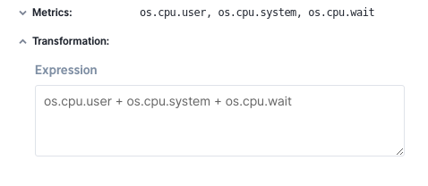
Transformations are used to modify metrics with a formula. Why is this useful? Imagine you collect
all individual types of CPU usage separately, like os.cpu.user, os.cpu.system, os.cpu.wait.
If you want to chart all of them as a single series you can added them up using an expression like this:
Another example is ratio. Imagine that you are interested in the ratio of the network input traffic and output traffic so you can easily spot suspicious behavior in the system, like a sudden jump of output traffic which does not correlate with the input traffic. In this case you would divide one metric by another to get the required series:
Math operators
Now you know why transformations are needed. Here is what you can use to build transformations.
We support math operators +, -, *, /, %. Parts of the expressions can be scoped
with parentheses (). Here's an example:
Functions
In addition to math operations, there are functions you can use. The list of functions will grow over time.
ifNull
Returns an alternative value if the main argument is NULL.
Usage:
ifNull(x, y)
Example:
coalesce
Checks from left to right whether NULL arguments were passed and returns the first non-NULL argument. This function takes any number of parameters.
Usage:
Example:
Consider you collect two different metrics with a similar meaning. On one host you collect a
metric called os.disk.usage and on the second host you collect a metric called
os.disk.used. You'd like to show a total disk usage from these two hosts. Unfortunately, metrics
are named differently. This is where coalesce comes handy. You simply call the function
coalesce(`os.disk.usage`, `os.disk.used`, 0). Depending on the metrics' name for a given
datapoint one of os.disk.usage, os.disk.used and 0 will be picked.
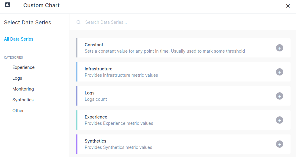
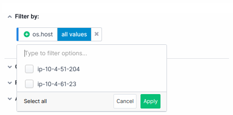
Filter by
The Filter section is used to specify criteria that are used to find matching data points.
Suppose you collect data from multiple hosts but you'd like to see a chart containing only
two of them (host1 and host2). You have to pick the right filter
in the Filter by section. You would choose tag name os.host and two tag values host1 and host2.
You can use variables as tag values so they can be configured dynamically from the report level.
Group by
In the Group by section you choose what data series to group on the graph. For example, if you
choose the os.host tag and for the aggregation in Aggregation field you choose all separately
the chart will show a data series for each host separately. Each data series is made up of
the selected metric on a particular host.
You can use variables as tag values so they can be configured dynamically from the report level.
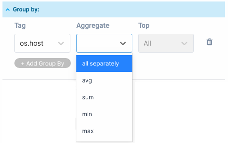
Aggregation functions
Let's get back to the example from the section above. If you choose aggregation function instead of all separately
only one data series is created for all the hosts. The result depends on the aggregation
function you choose. The aggregation function determines how the metrics are
aggregated into a single data series. You can pick one of avg, sum, min, max.
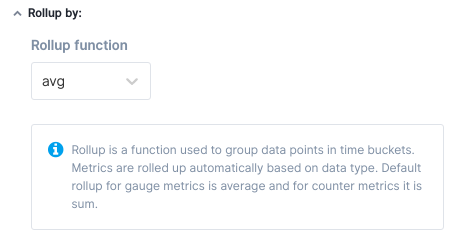
Rollup by
Data points sent to Sematext Cloud have a time label. If a metric is updated every 10 seconds, and you are
looking at a 24-hour time range, you need 14,400 points to display all data points.
Displaying so many data points on the chart would make it unreadable and would negatively impact
your web browser's performance. If we build time buckets each containing 600 data points
we will have 24 data points to display on the chart, one data point for each hour. The Rollup function
controls how time buckets are built, meaning what aggregation is performed. You can pick
one of avg, sum, min, max as a rollup aggregation function.
Each of the predefined metrics has its own default rollup function defined depending on the type of
the metric. All gauge metrics use the avg rollup function and all counter metrics
use sum rollup function. In some cases it makes sense to customize the setting.
NOTE: Recommended for expert users.
Variables
Variables are used to dynamically filter and group components by tags.
Filters from the Filter by section don't have to be configured statically when a chart
is created. Sometimes you need charts on the dashboard to react to a global filter
change.
Consider a case where you're troubleshooting a system and you realize that one of the hosts has problems. You have a dashboard that displays aggregate information for all hosts. You can, of course, reconfigure all dashboard charts (aka components) so they show data only for the host you're interested in. As you might expect this is not a very efficient way to troubleshoot. This is where Variables come into play.
Variables can be created by selecting the "Manage variables" option in Report settings.
You can create a tag variable that points to the os.host field.
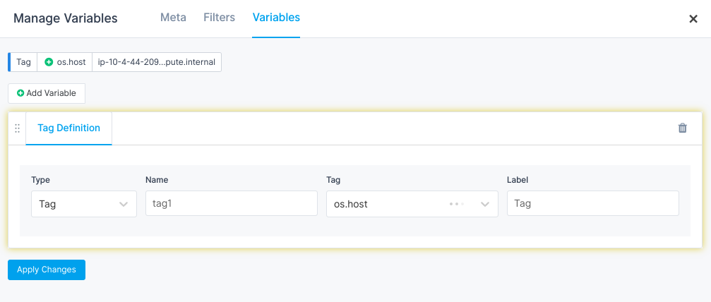
A variable is automatically added on top of the dashboard. A variable becomes a drop-down component from which you can select tag values and charts automatically react on the change.
Once the variable is defined it should be added to charts that should react to variable changes. Variables can be used both in the Filter by section and in the Group by section in Chart Builder.
Suppose you have a dashboard with charts that show aggregated metrics about disk usage on several hosts.
You want to troubleshoot a problem you've spotted on one of the charts that looks like a small jump in disk usage.
To identify the root cause you can try to find the problem by grouping metrics by the os.host
tag. A group variable can let you do that from the dashboard level without changing the
definition of the series in any of the charts. Now imagine that you've grouped data by os.host but still don't
see any obvious problems because the disk usage jumped on all hosts. You may then decide
to also group by os.disk and by doing so you may realize that the problem was only with /dev/nvme0n2 disks.
Style
In the style tab, you configure what the chart looks like. You can select bar, line, area and point
charts. In addition to the chart type, you can choose a color from the palette and group color scheme. The main
goal of a group color scheme is to determine the colors of the series from the same group. When you group a metric by
os.host as a result you get a couple of series. Each series can get a different color.
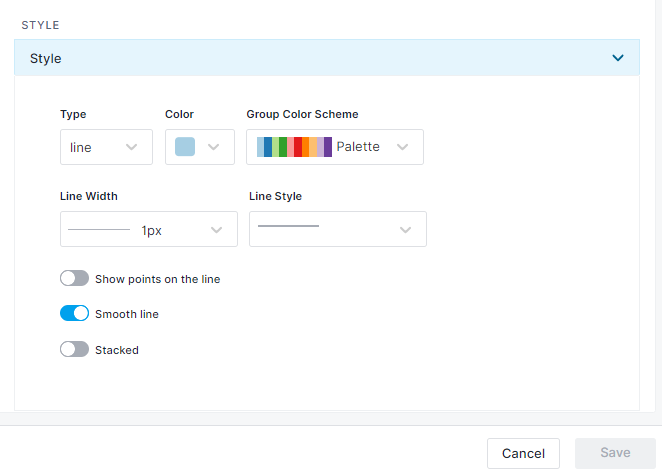
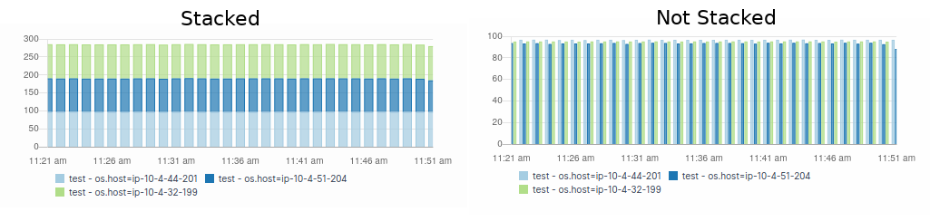
A very important feature in the styles tab is the "Stacked" option. When you select the checkbox data of a given series is stacked. This is very useful for area and bar charts. Below you can see a comparison of stacked and non-stacked bar charts.
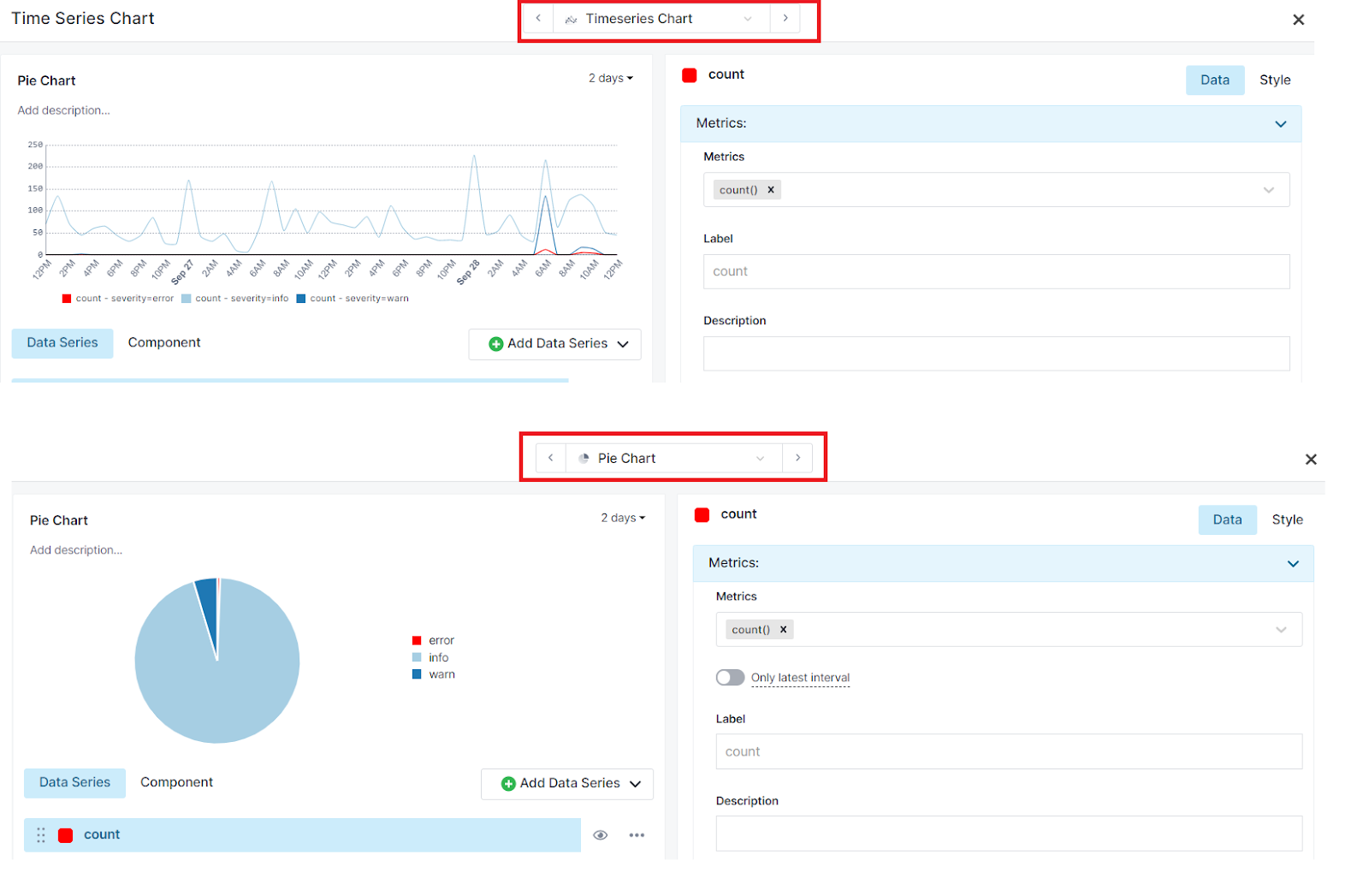
Component Switch
You can switch between different kinds of component visualization types.
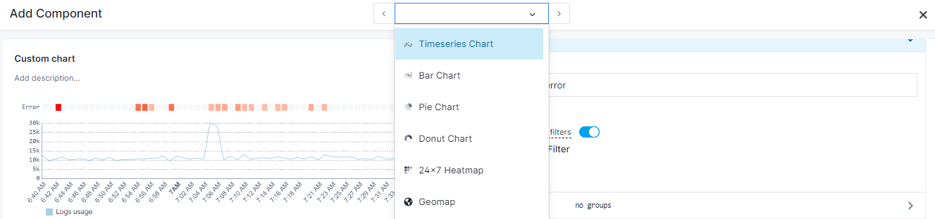
E.g.: You can switch Timeseries to Pie Chart directly from the Chart Builder to see how the data series will be represented in each of them.