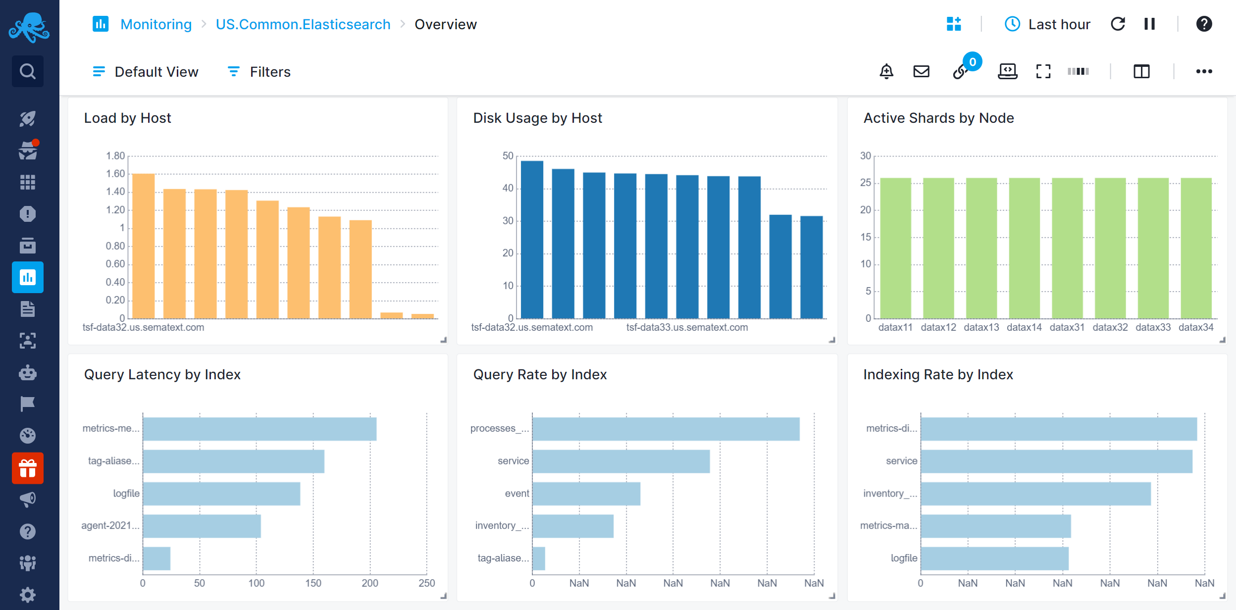
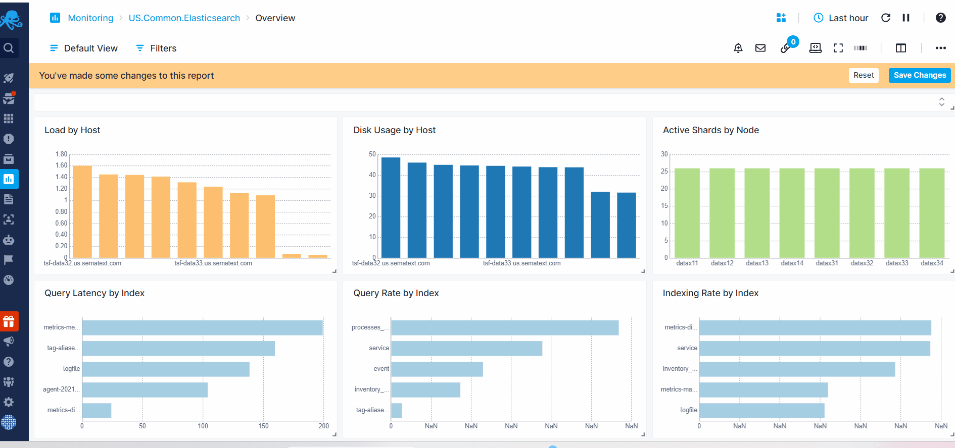
Bar, Pie, and Donut Charts
Bar chart is a graphical representation that uses rectangular bars to display data values for different categories or groups, offers comparisons among the items being measured based on the length or height of the bars.
Pie chart is a circular statistical graphic divided into slices to show numerical proportions. Each slice represents a portion of the whole, and the size of each slice shows the relative quantity or percentage of that portion in relation to the total. The slices form a complete circle, and the emphasis is on comparing the sizes of the different slices to see proportions. Donut charts are like Pie Charts, but with the hole in the center.
The displayed values depends on the selected data time picker located at the top right of the dashboard.
Configuration
You can configure these charts either during their initial creation or afterward by clicking on the three dots that appear on hover and selecting 'Edit Component'.
- Choose All Apps or a specific App that you want to fetch data from.
- Choose one or more metric
- Enter optional parameters such as:
- Transformation
- Filter By
- Group by
- Rollup By
While building the chart, a preview is available on the top left. Additionally, you have the option to add multiple data series, clone existing ones, adjust visibility.
You can also click on a data series to instantly apply its associated filter, query, and grouped field's value to the report, making it easier to drill down into specific logs or metrics.